Megacentro Network: Núcleos Chile
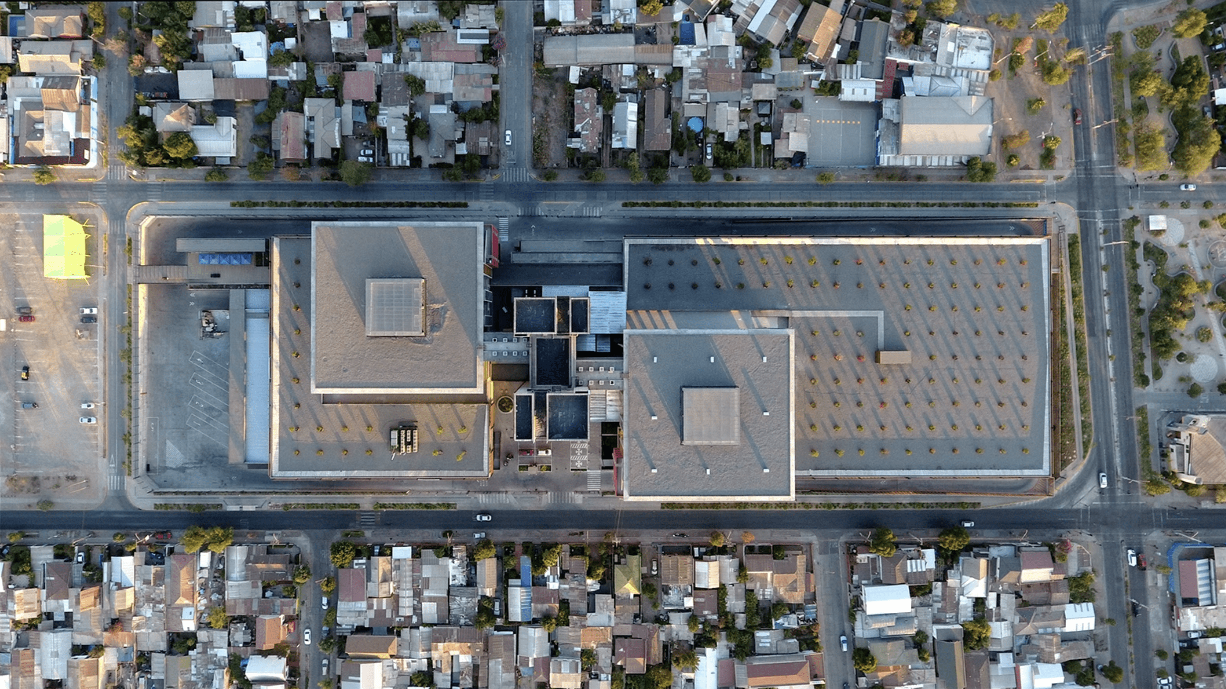
Red Megacentro is a real estate management company belonging to Sistema B; it provides infrastructure solutions through the leasing of warehouses, offices and large distribution centers. Seeks to be a development manager generating positive impact in the sectors in which it operates. They have 46 logistics operation centers in Chile, Peru and the United States. Since 2017 we have developed wayfinding for the multi-program projects Núcleo San Diego, Núcleo Bellavista, Núcleo Puente Alto and Núcleo Ochagavía, totaling 160,000 m2.
Background
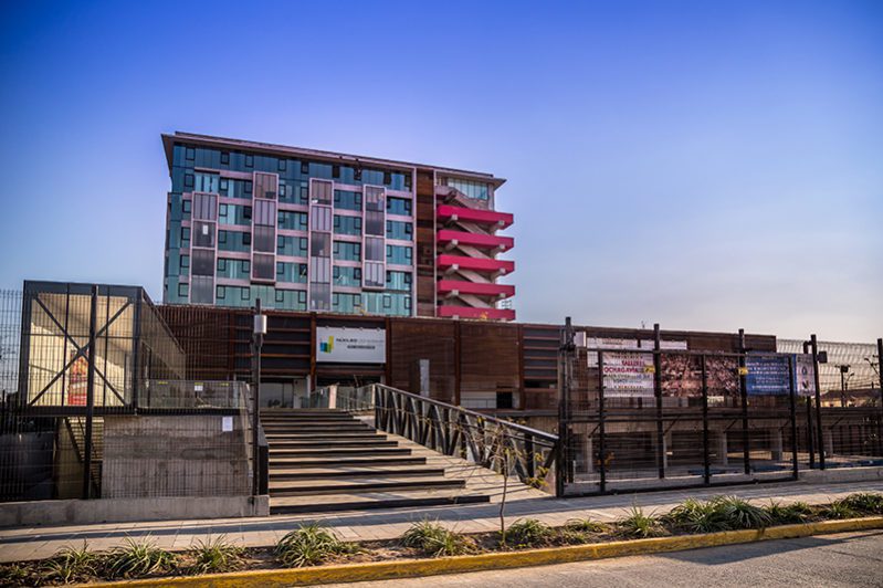
It is located where the former Ochagavía Hospital, better known as the “White Elephant”, was built 40 years ago. The iconic building of modernist architecture was abandoned until 2013, when Red Megacentro started the largest urban recycling project in the country. Inaugurated in 2016, the project is installed as a public-private partnership, operating as a civic and economic development center for the commune and surrounding areas. In addition to the coexisting programs of the core buildings, the project includes a Health Nucleus.
Challenges
- Transform the experience of diverse users within a complex building designed to be a hospital.
- Reconvert and enhance the building through a low-cost implementation strategy.
- That the building remains in operation during project implementation.
Findings
- Widespread disorientation, the project’s signage project was confusing and generated stress for users.
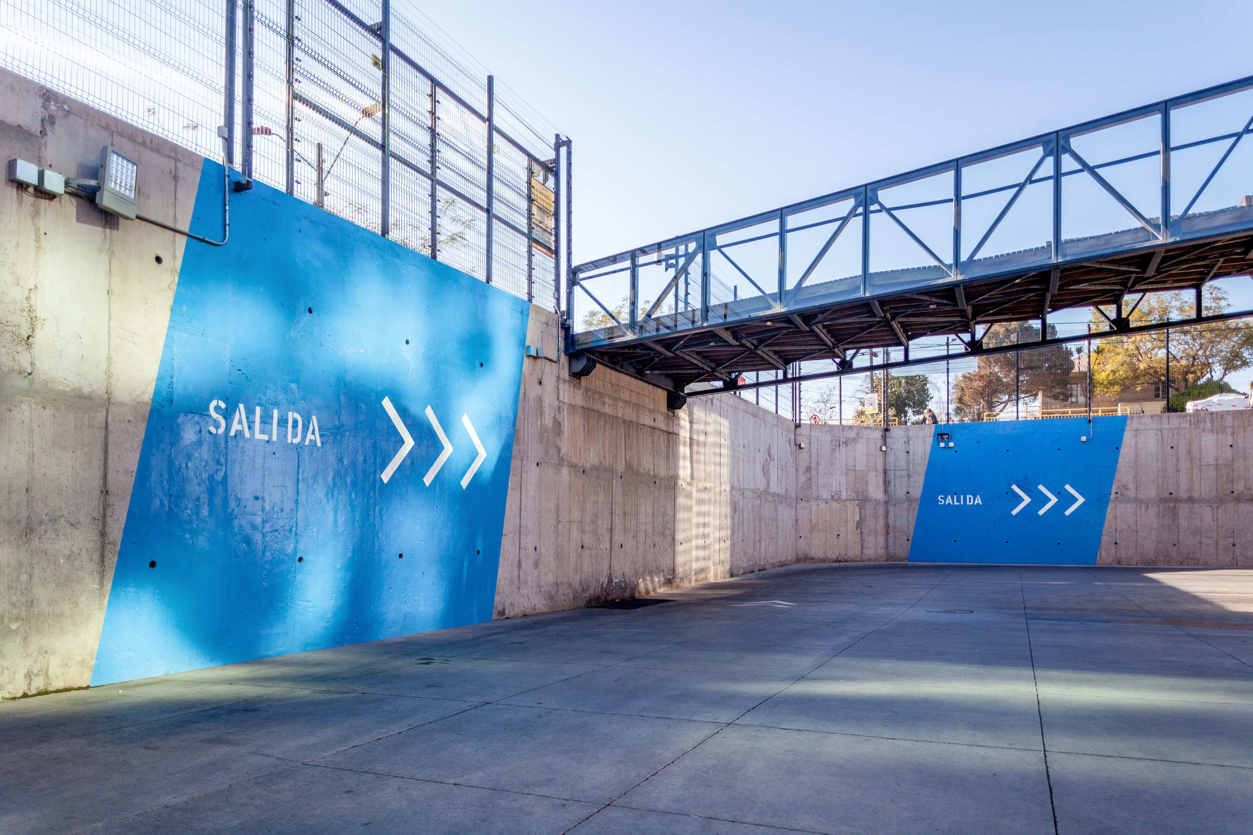
- Feeling of abandonment in connecting spaces.
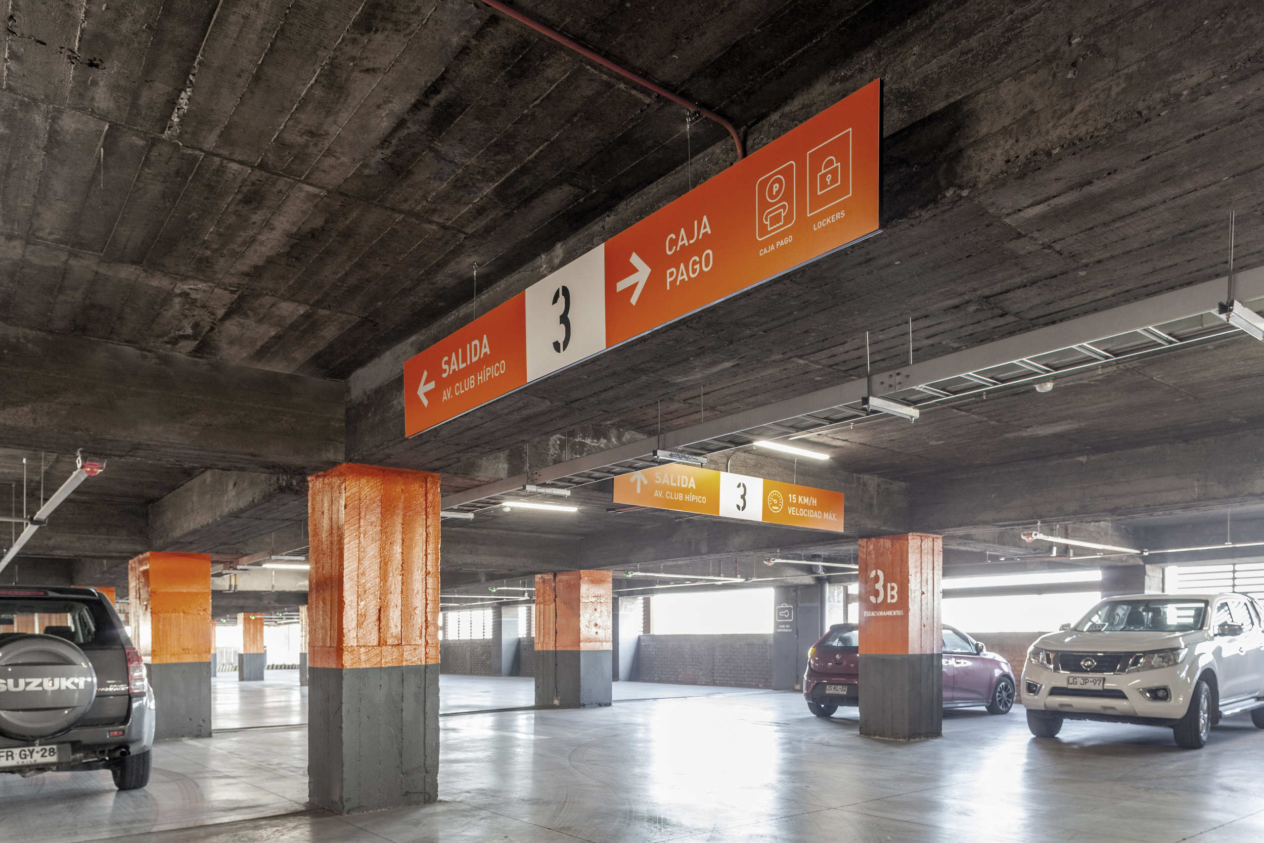
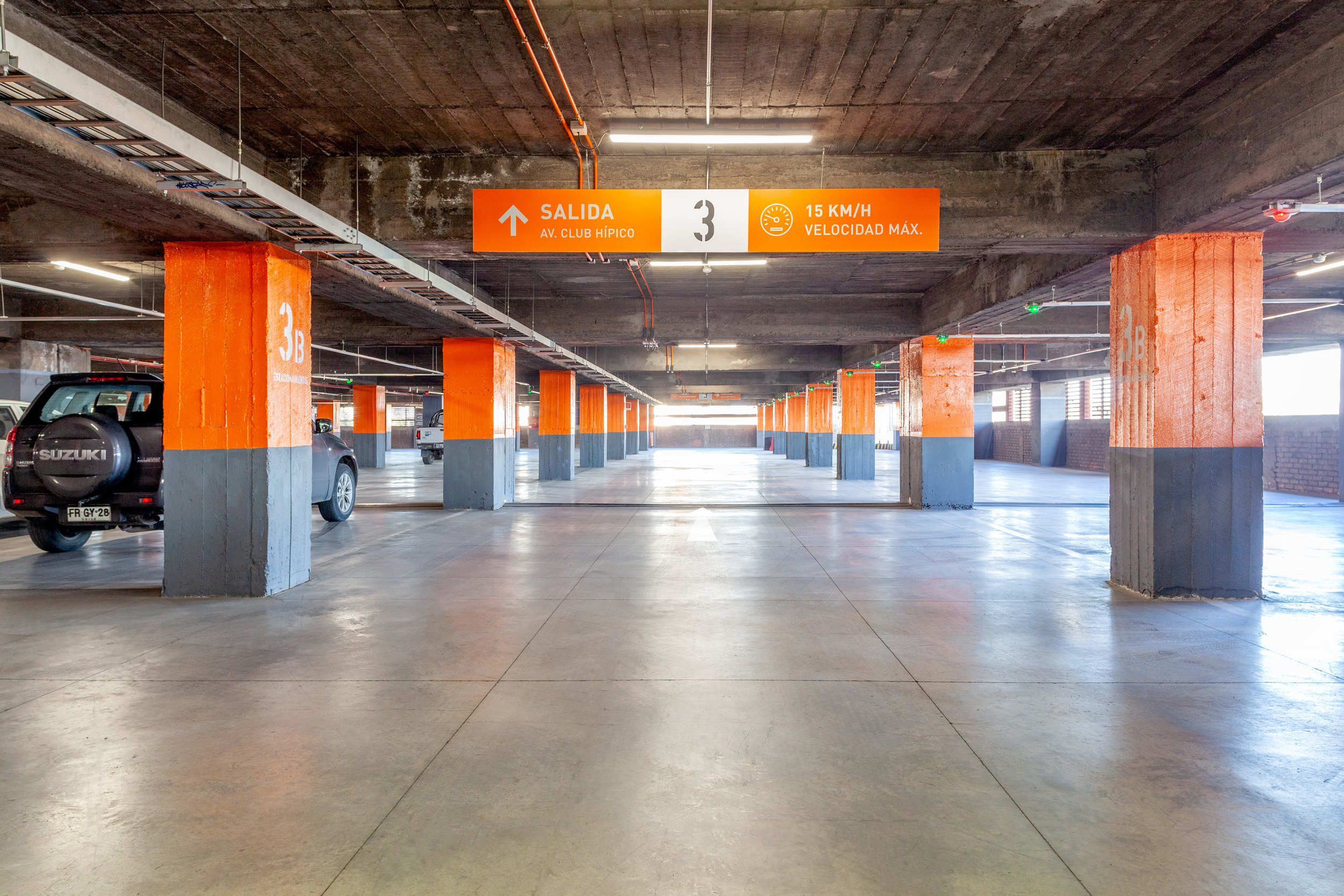
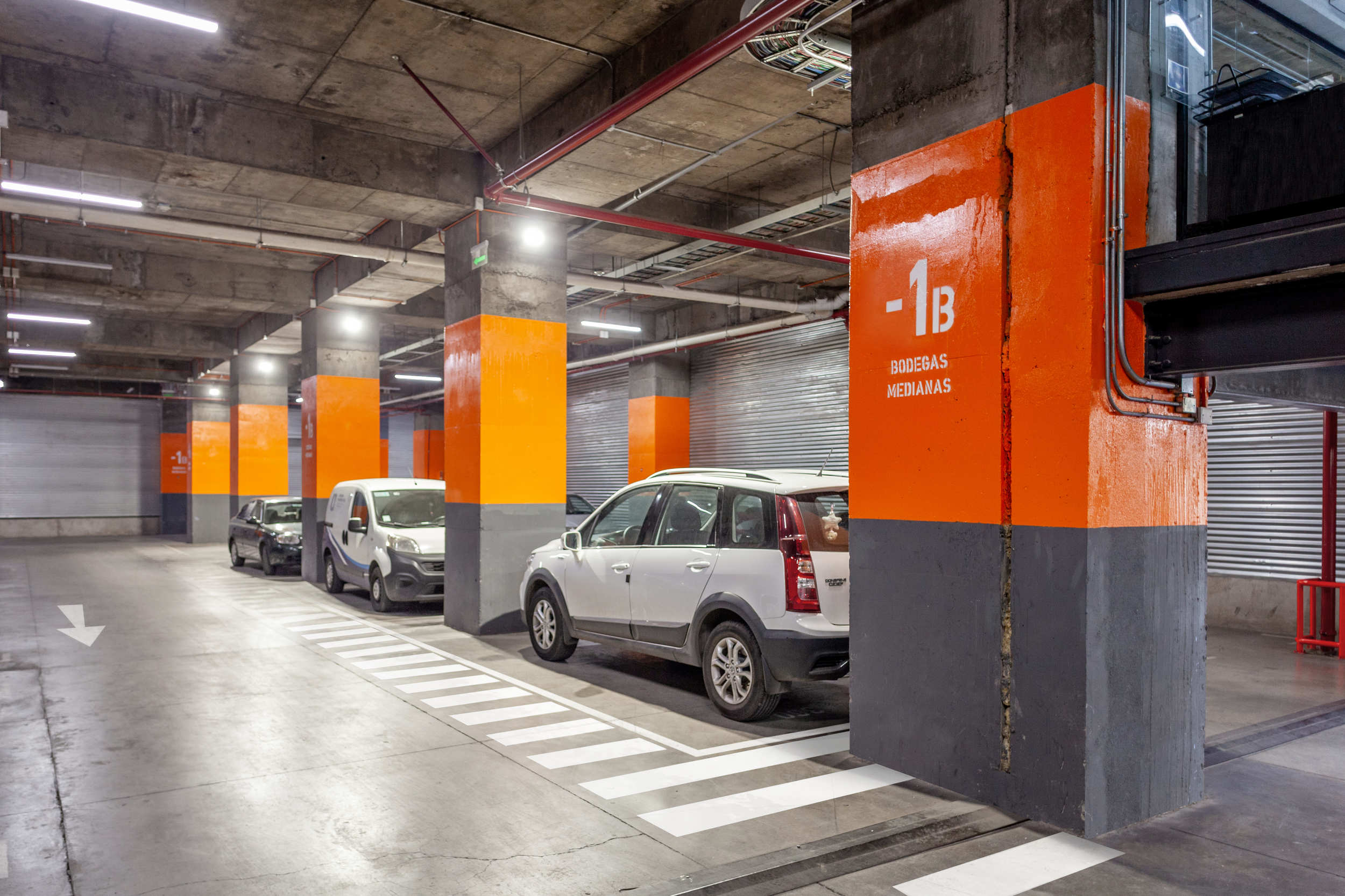
- Poor visual comfort in subway and parking areas.
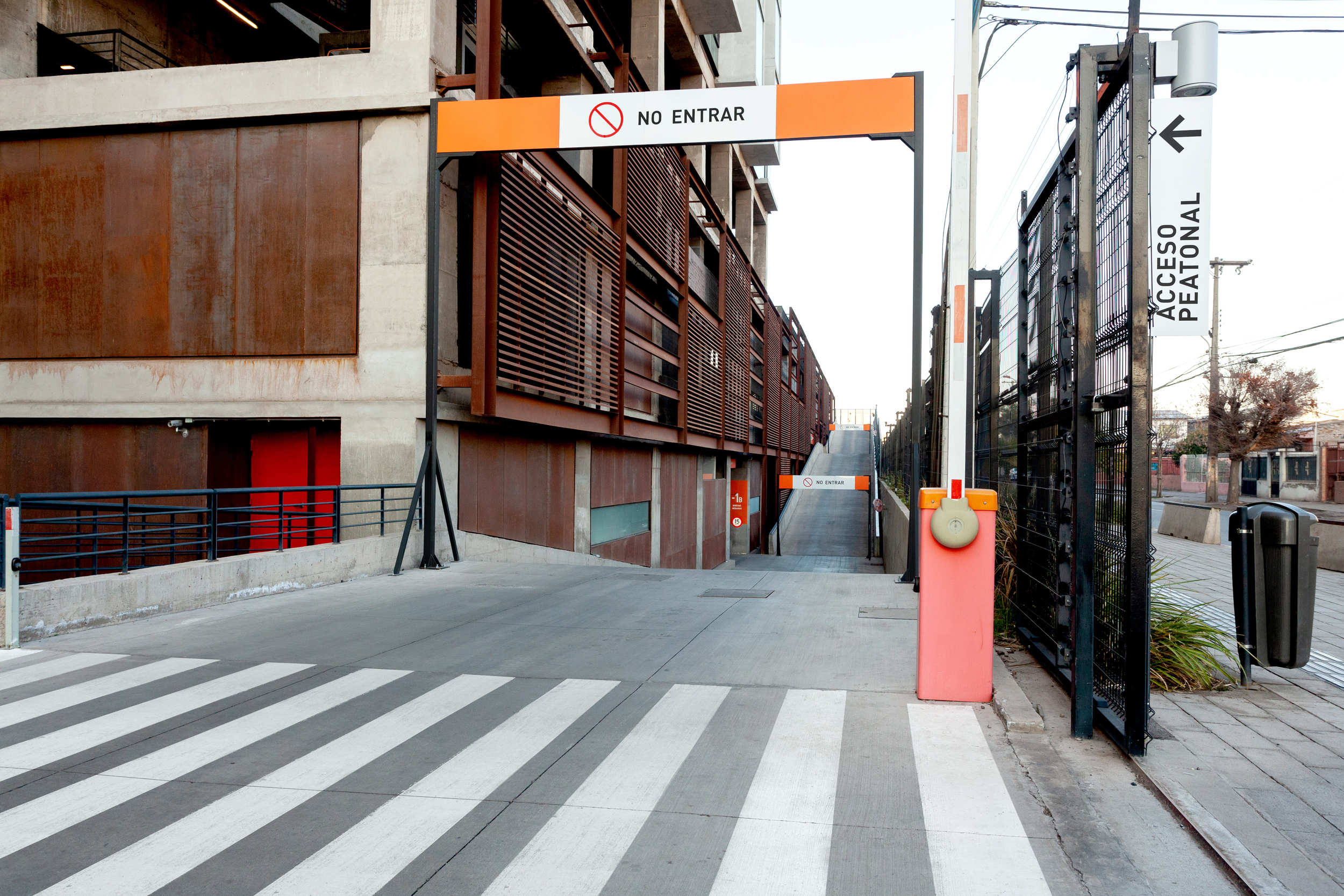
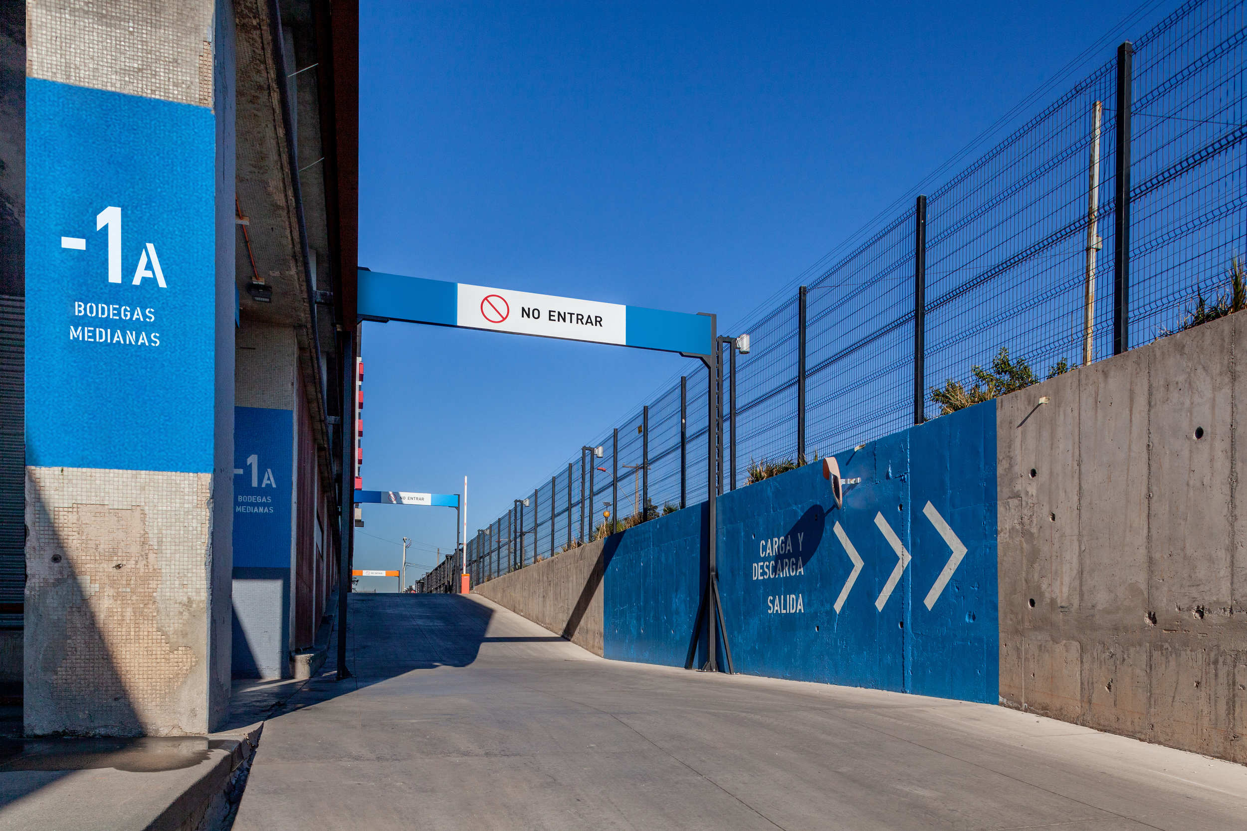
- Lack of control of vehicular and truck access.
The strategy
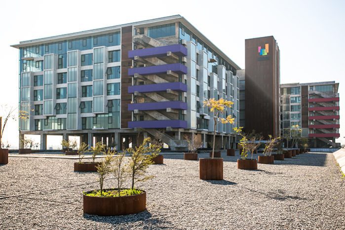
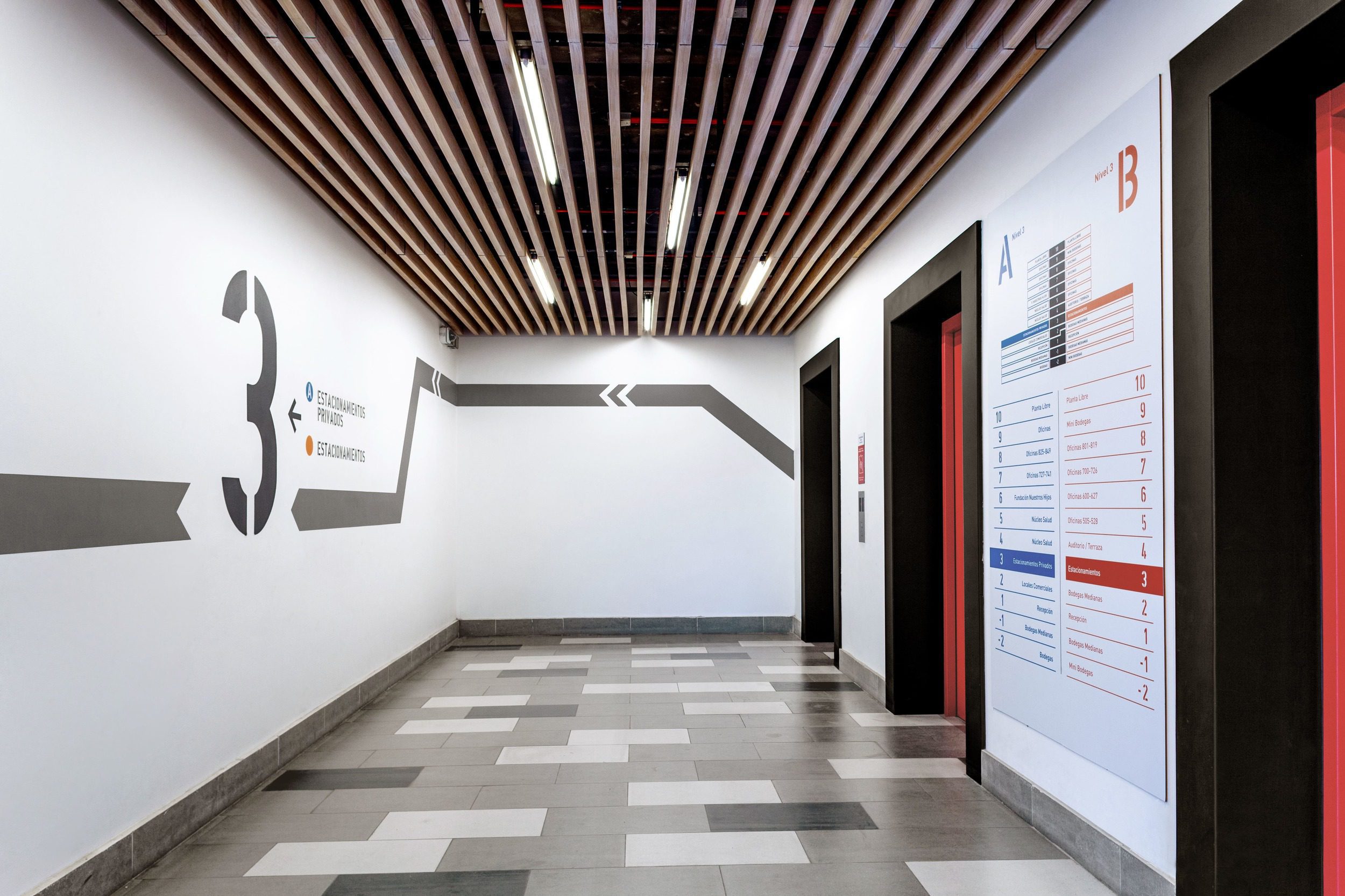
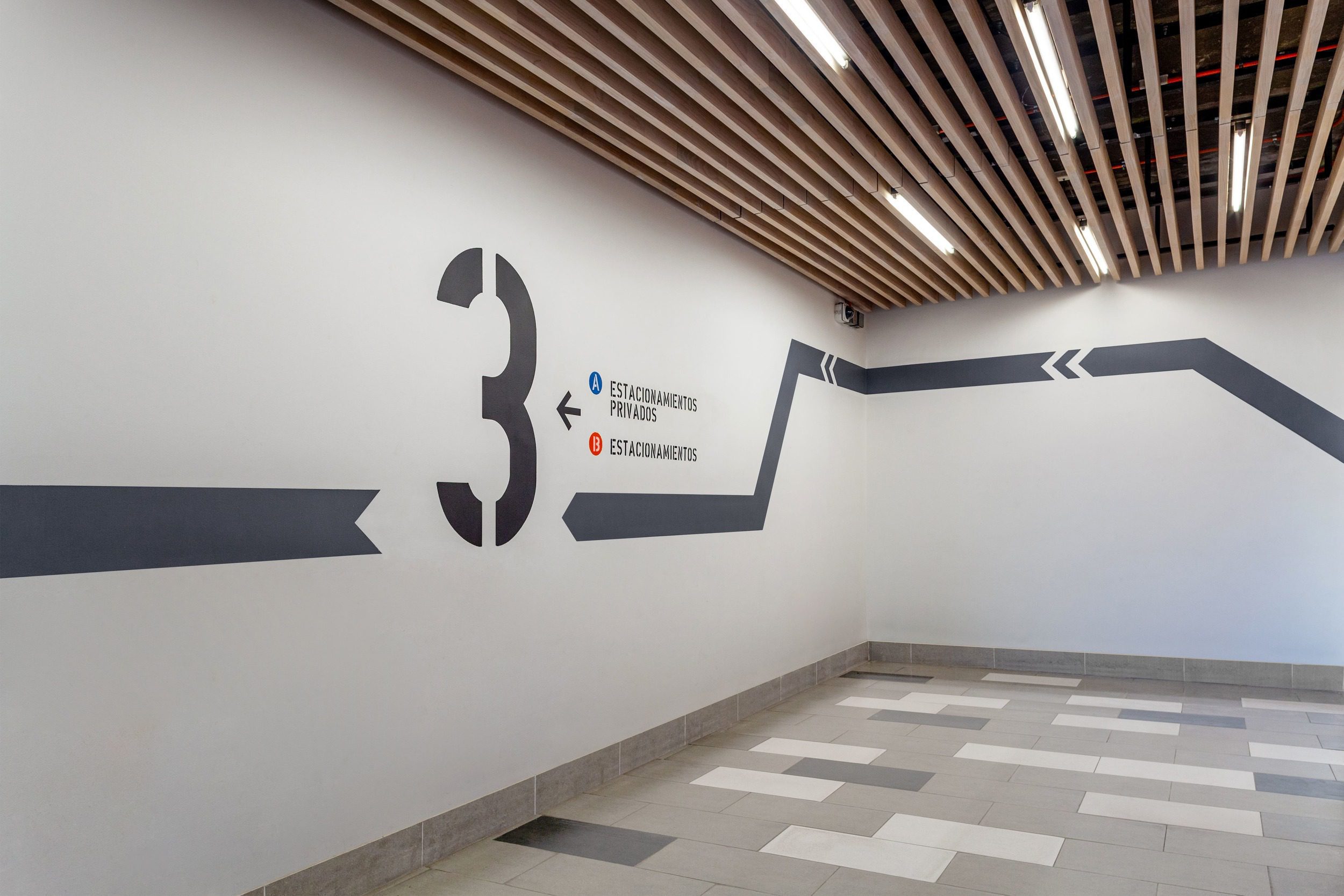
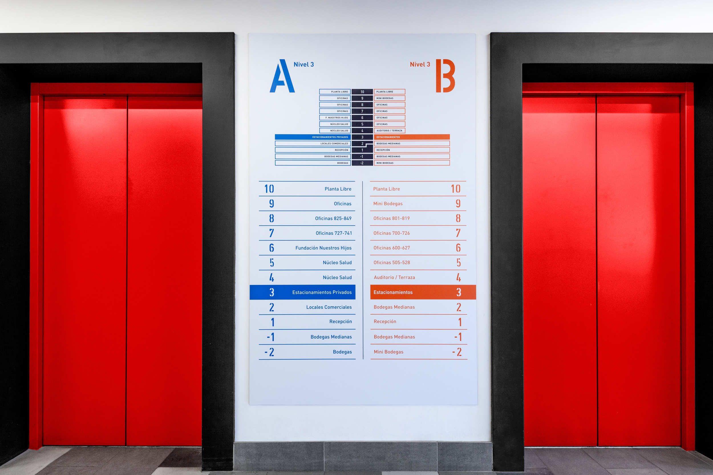
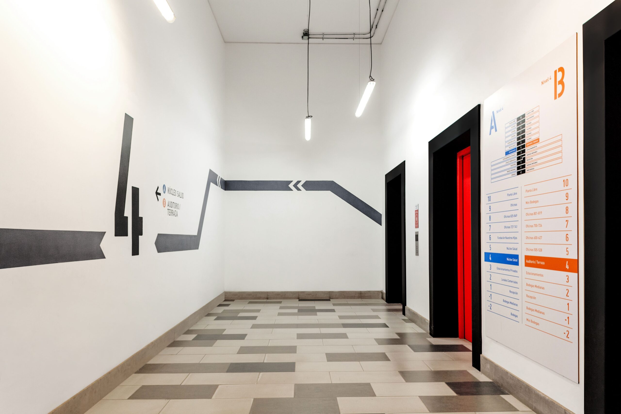
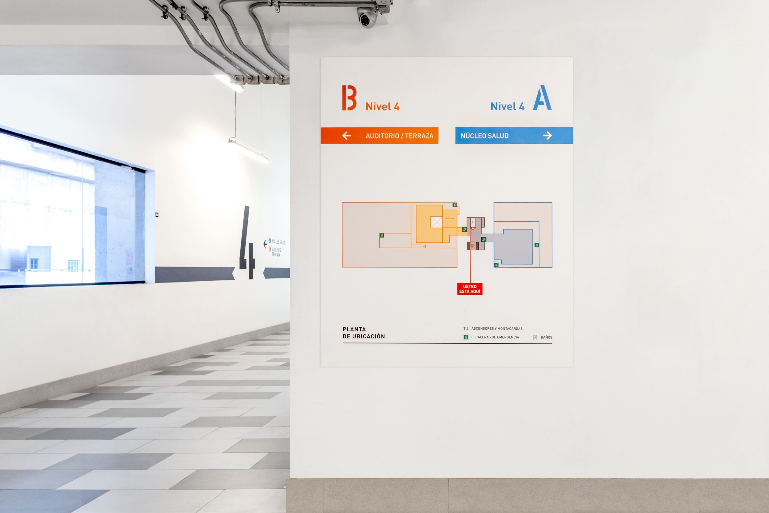
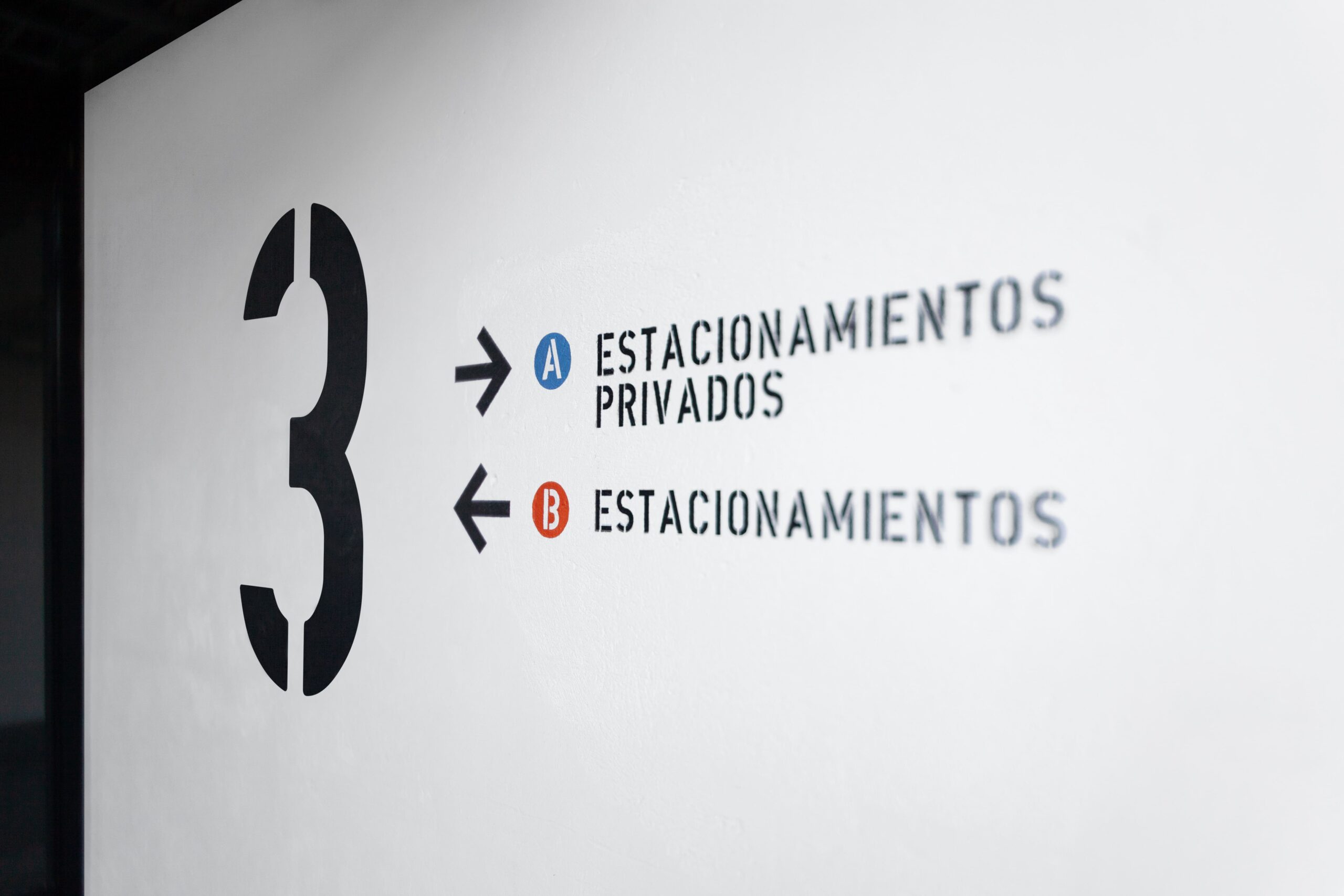
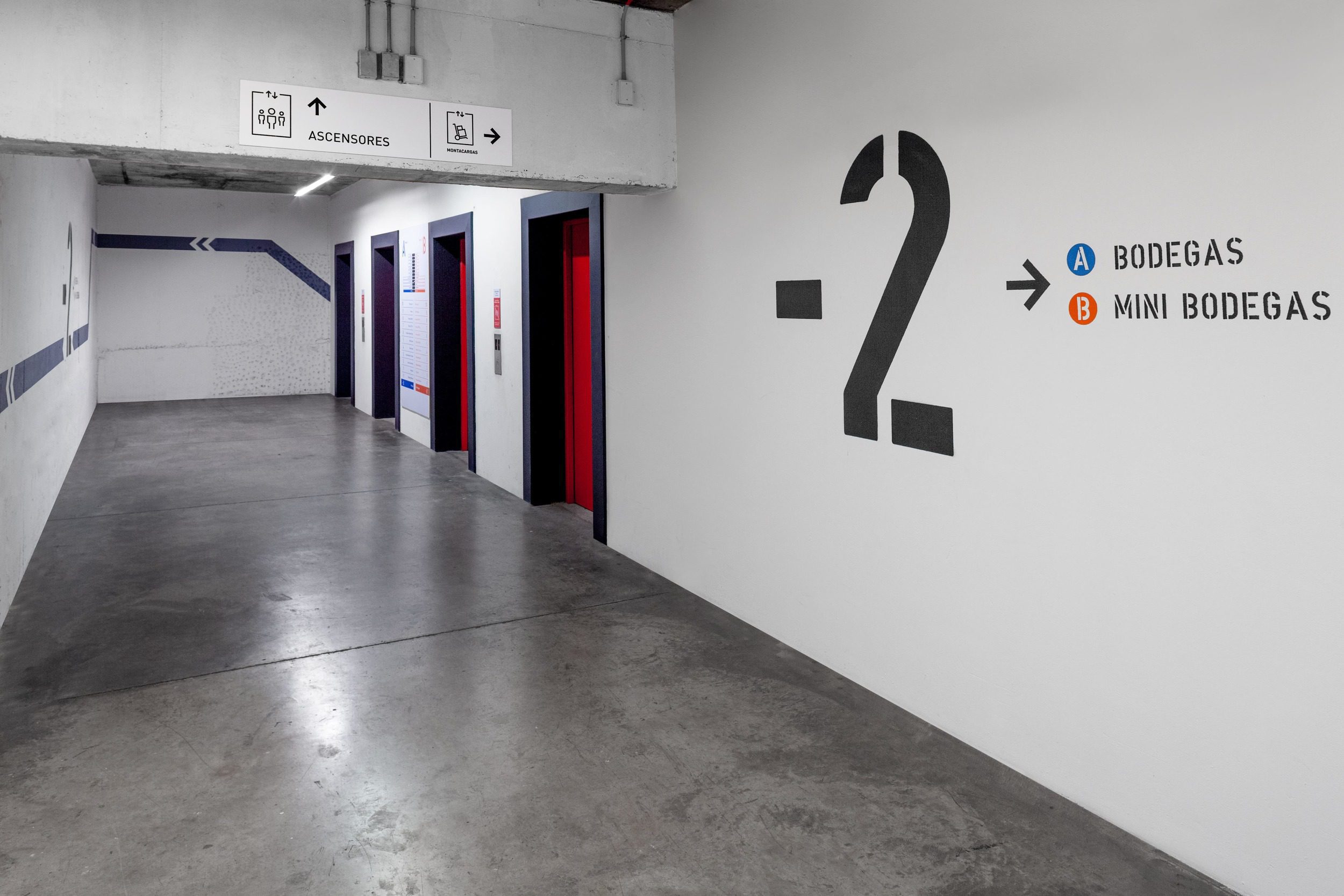
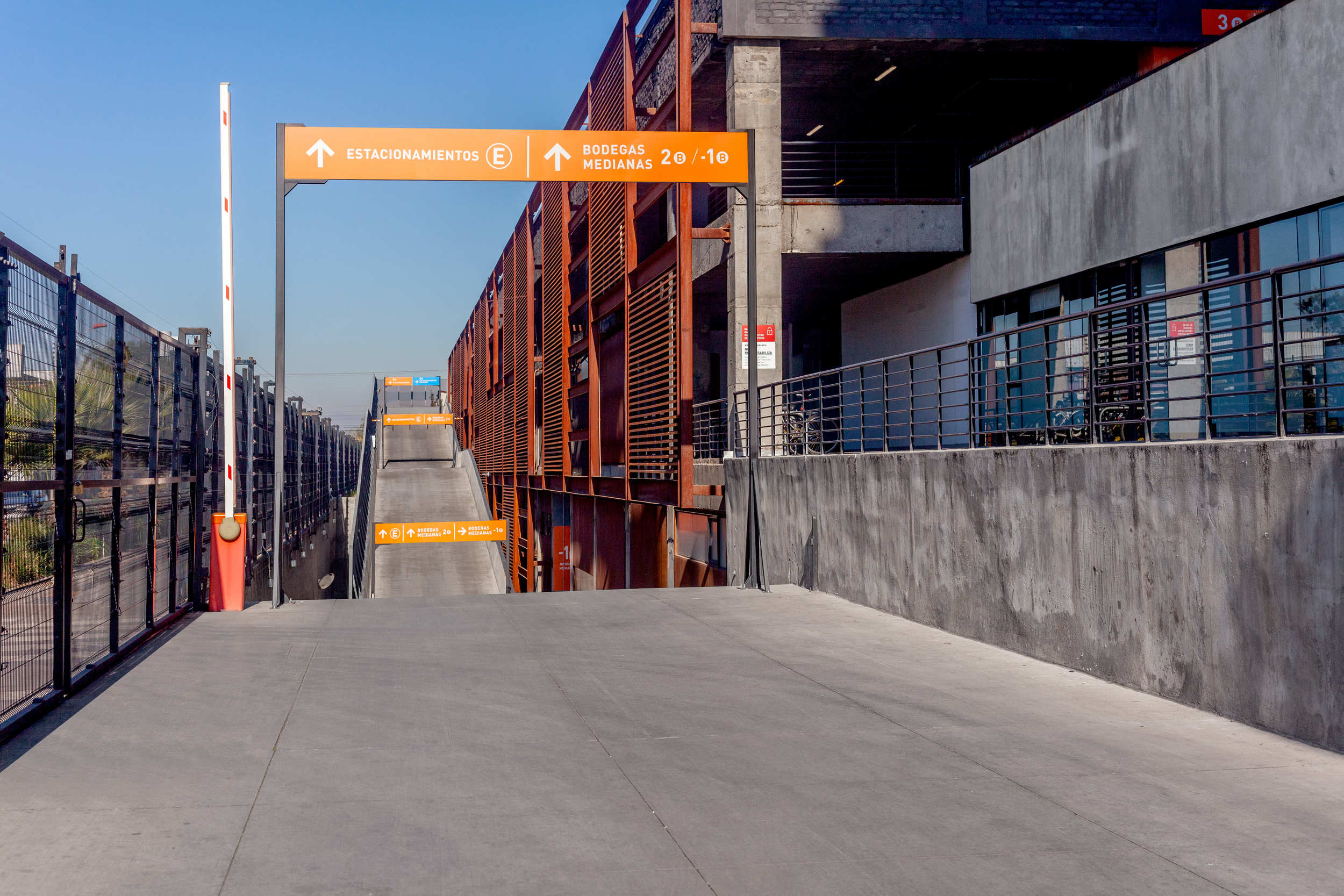
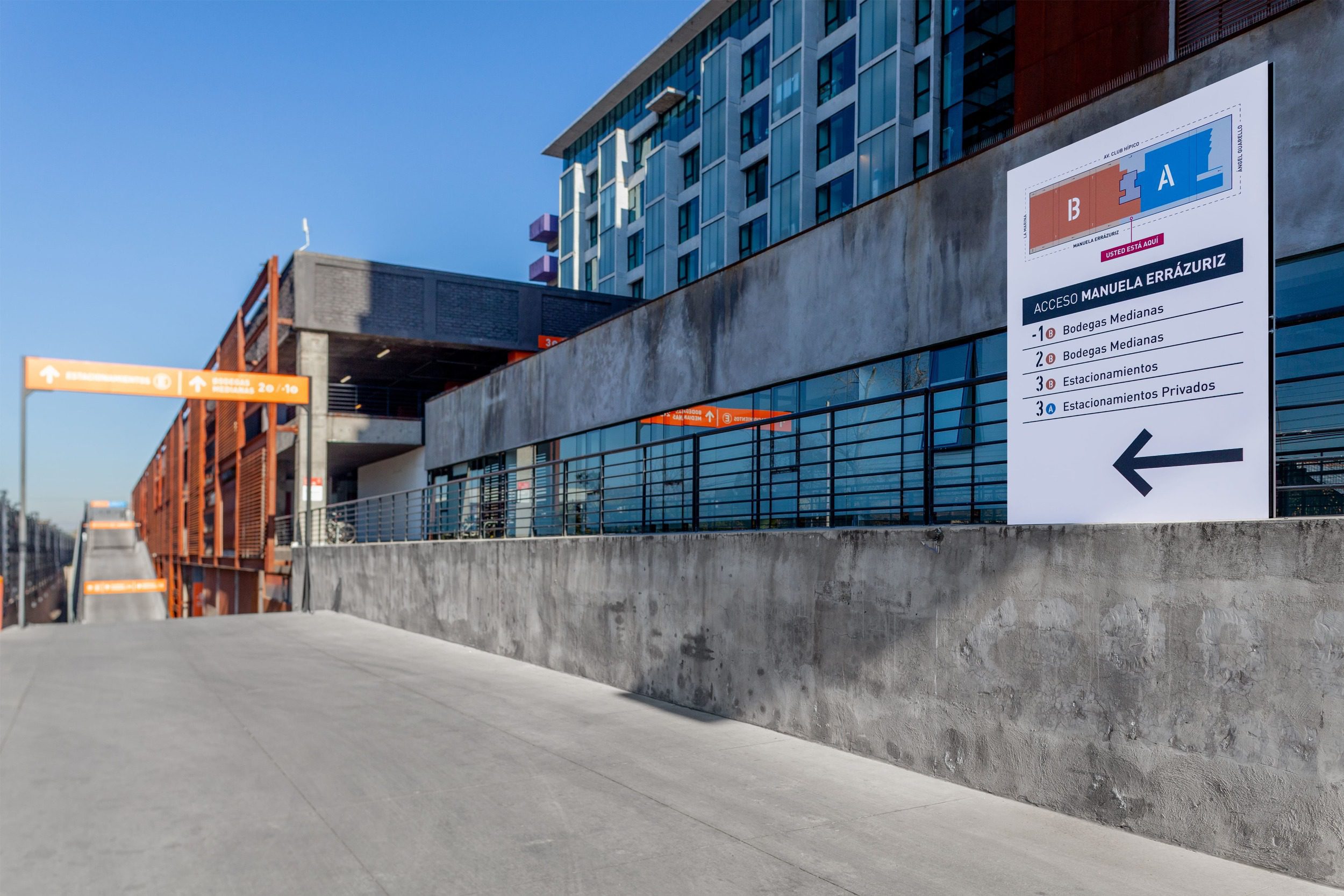
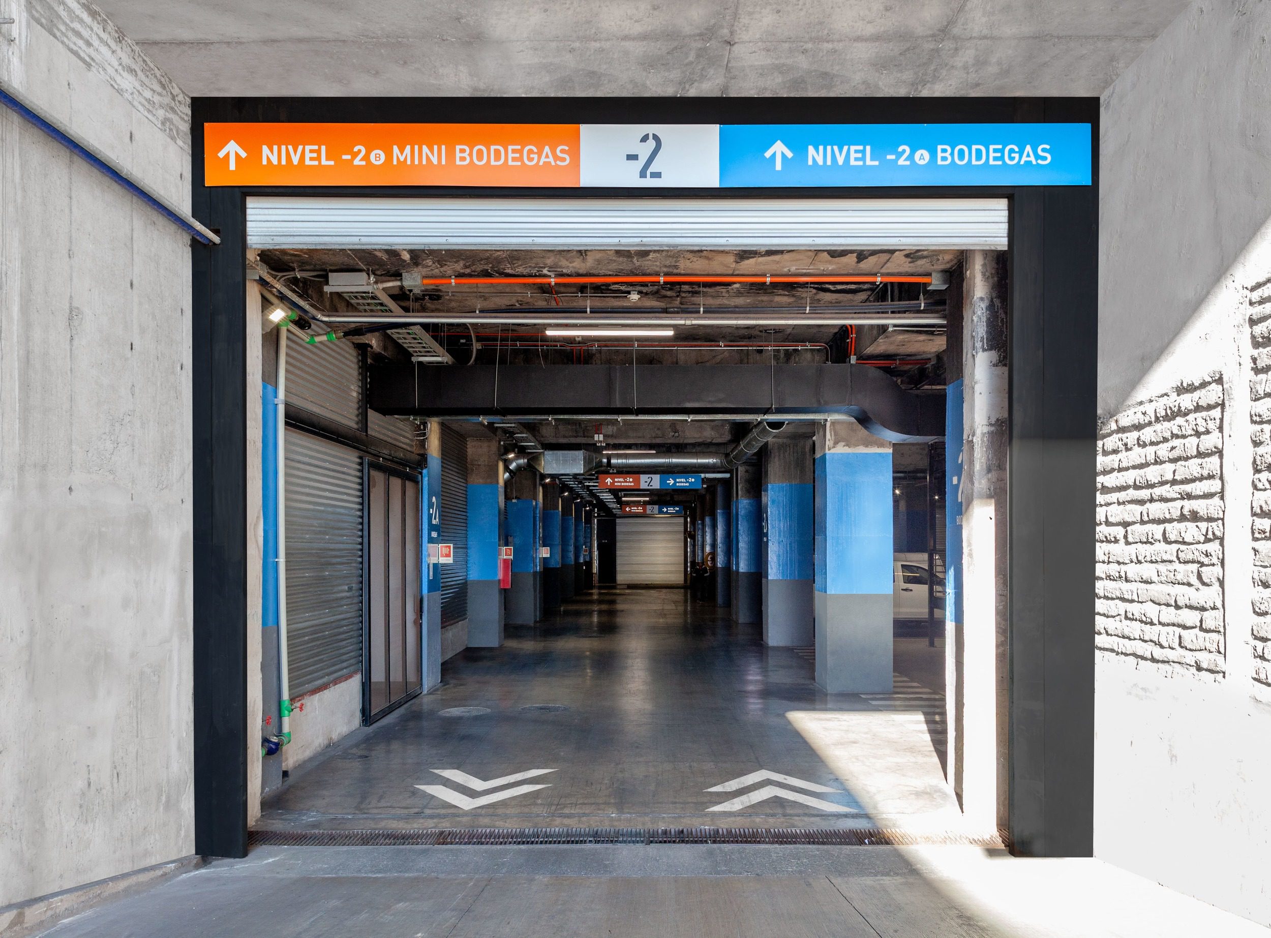
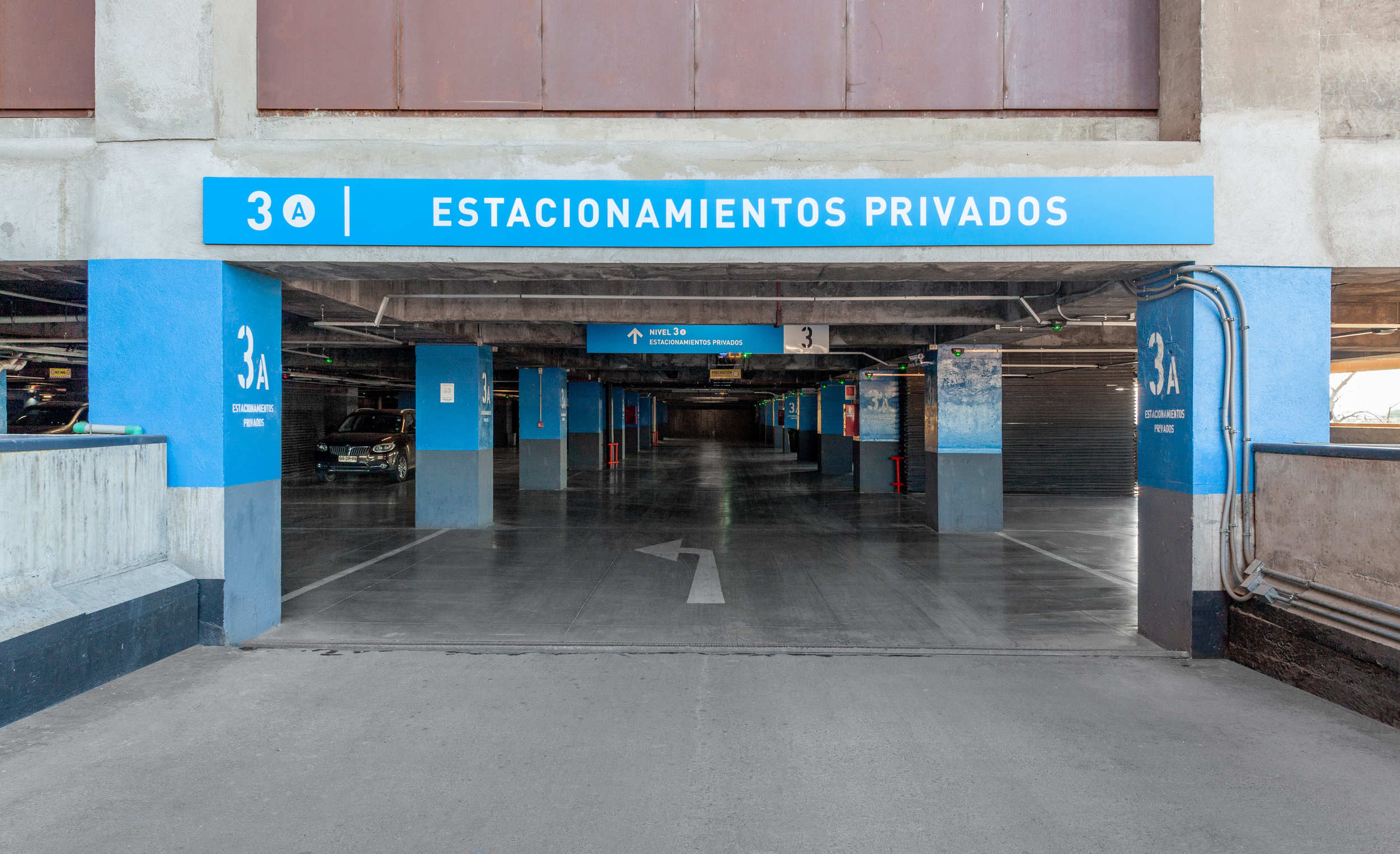
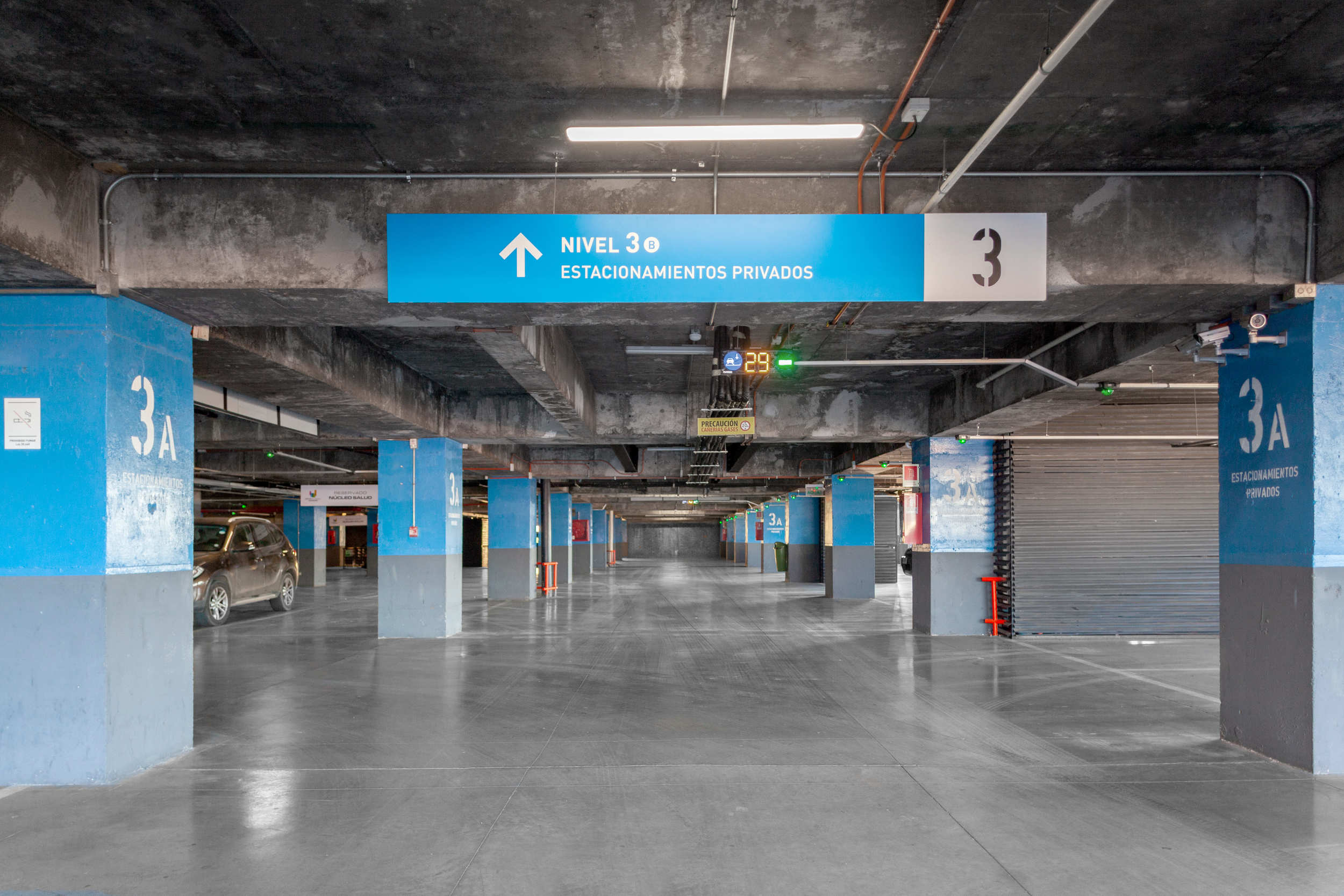
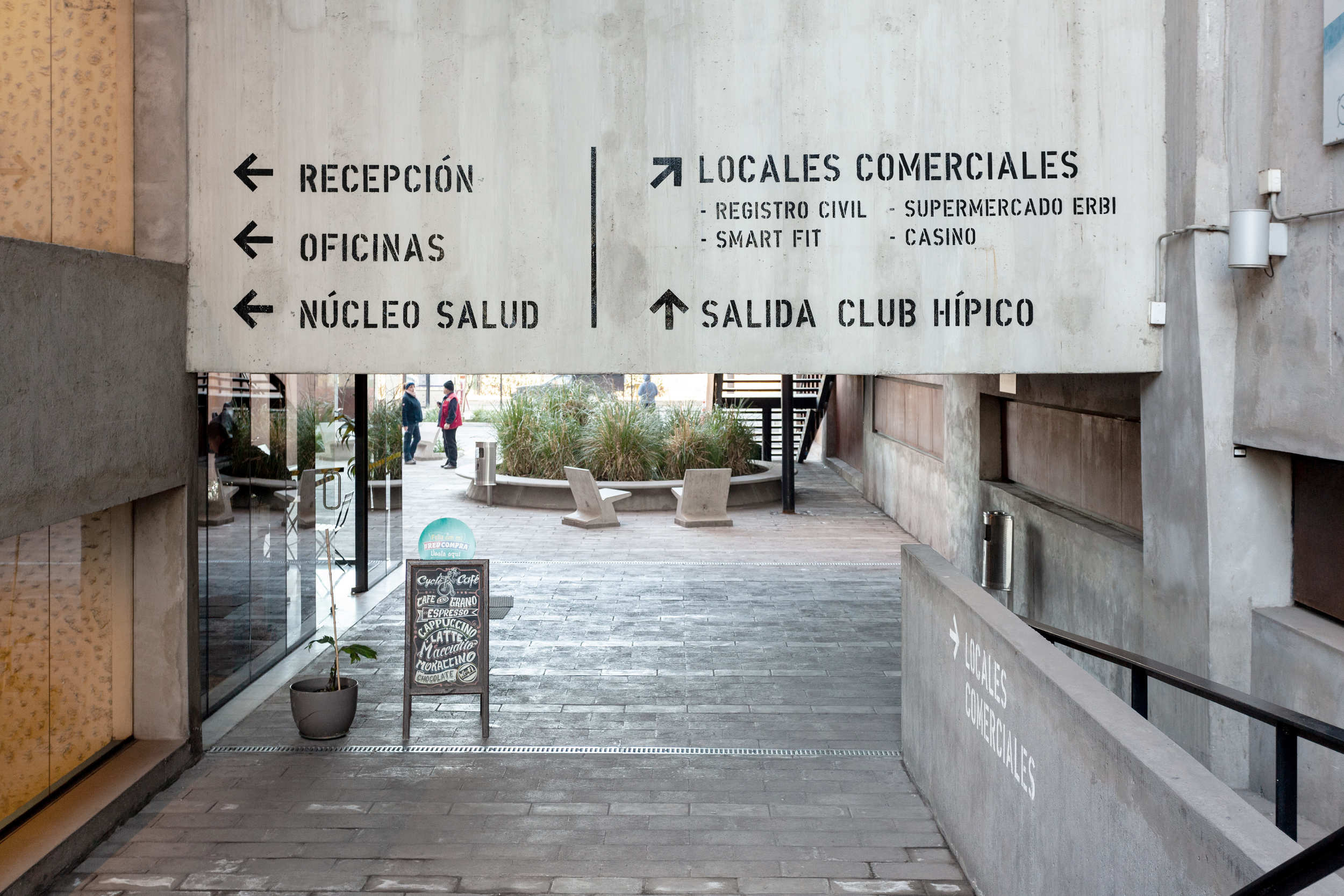
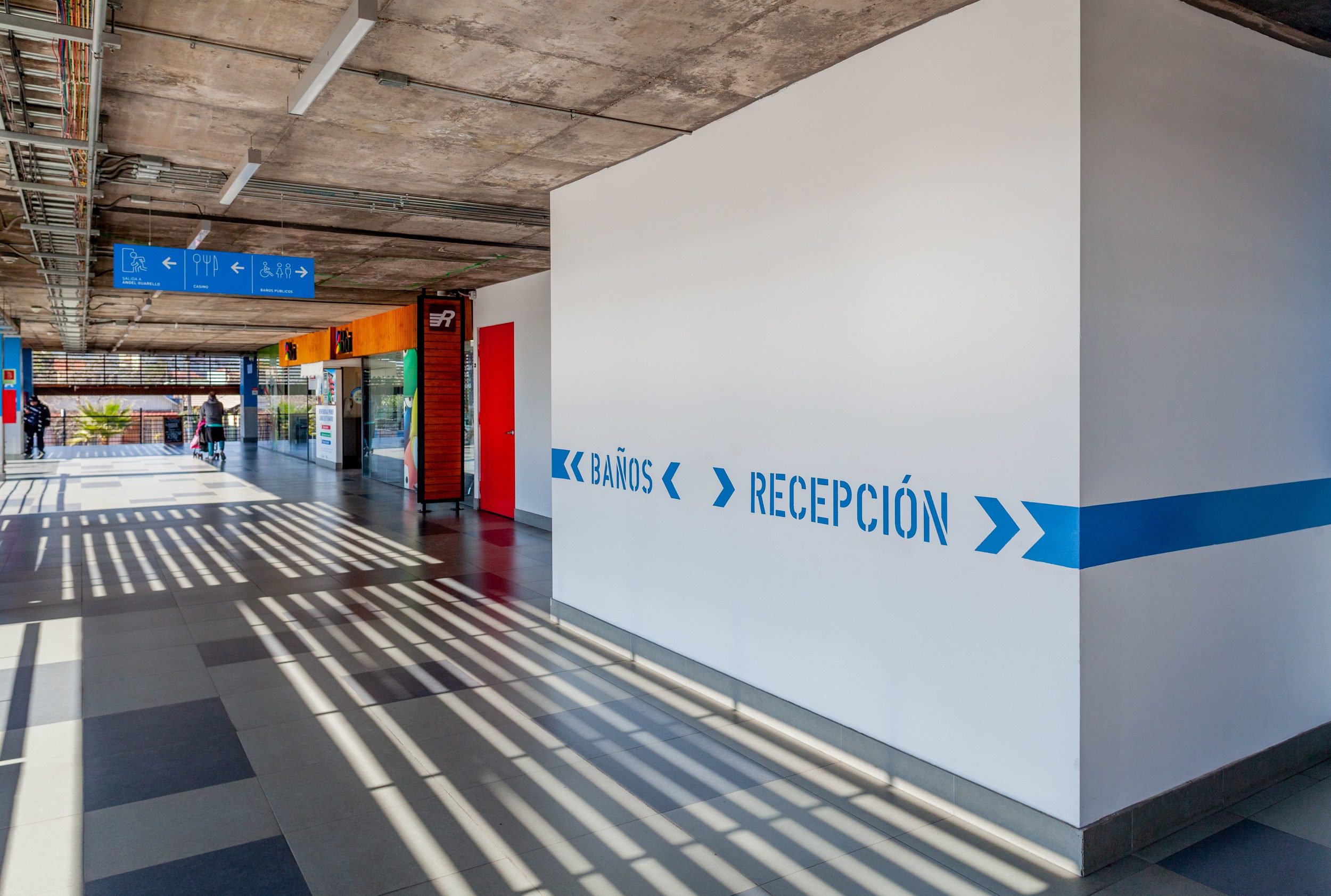
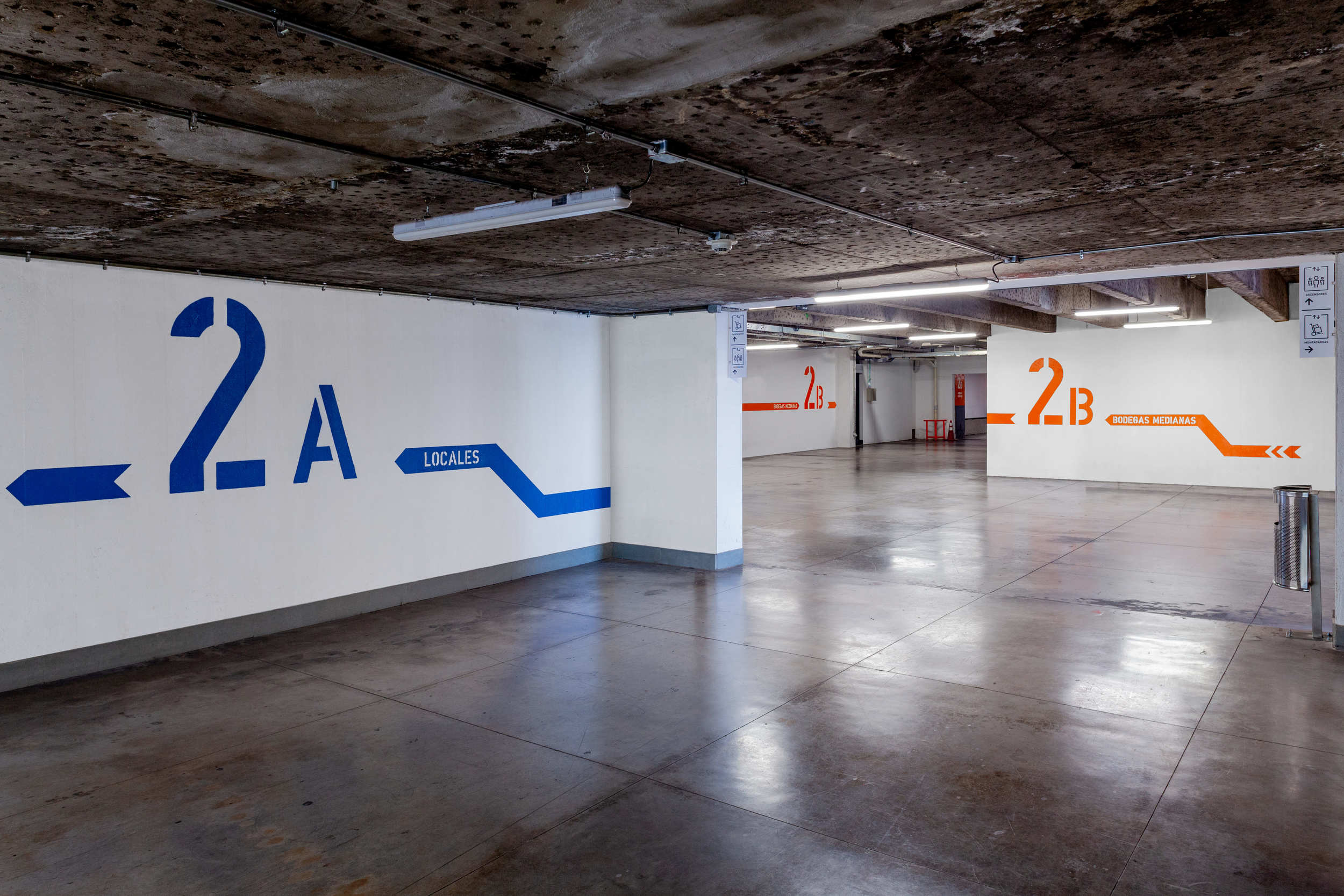
We conducted an analysis of the previous system in order to propose a strategy based on the diagnosis that emerged. We used a tower orientation system based on orange and blue colors together with letters A and B, instead of north and south; we renamed the levels to coincide with the elevator buttons and to have sequentiality between upper floors and subway levels; accesses were regularized according to pedestrian and vehicle typology, making signage visible for the latter; we provided visual comfort to warehouses and parking lots that generated a feeling of abandonment; and we established a single graphic line. We developed a total of 1,235 signage points, divided into five typologies.
Results
- The wayfinding system we developed added value to the property and corrected pre-existing problems of perception and simultaneous navigation.
- The wayfinding system optimized the project and dramatically improved the experience of the users and the inhabitants of the surrounding environment, significantly increasing their satisfaction.
- The level of complaints about disorientation within the building was reduced.
read more >
