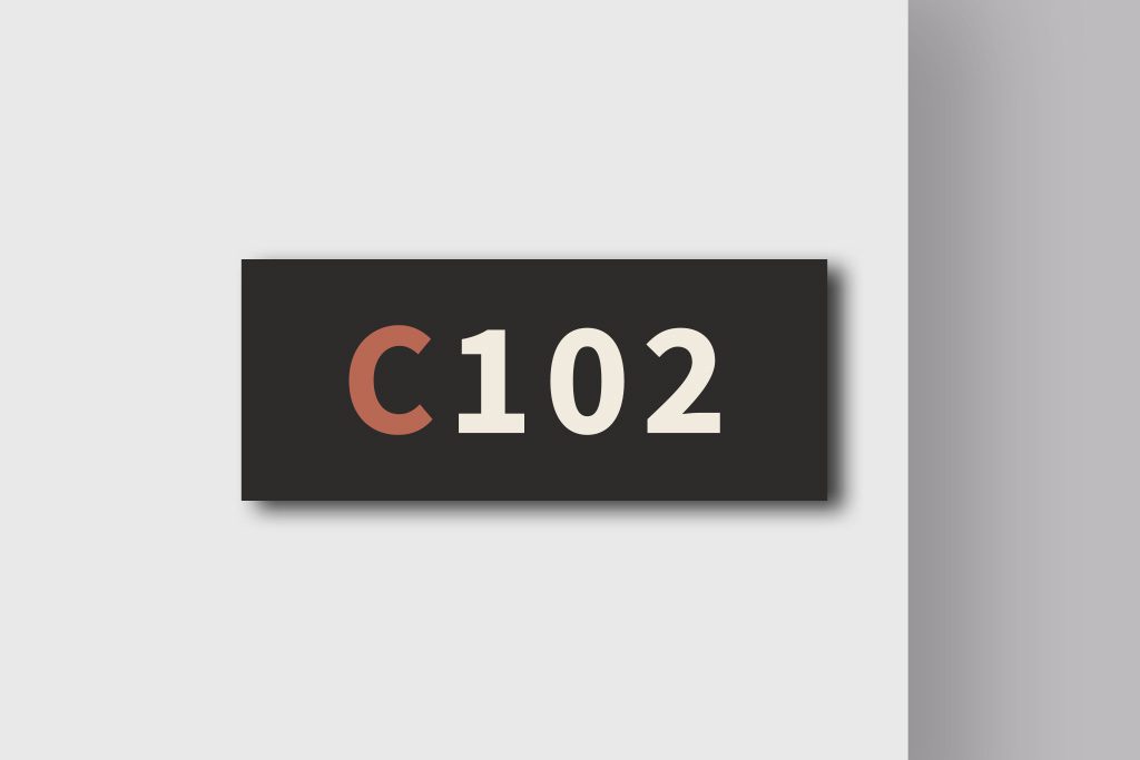
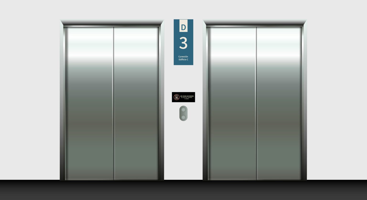
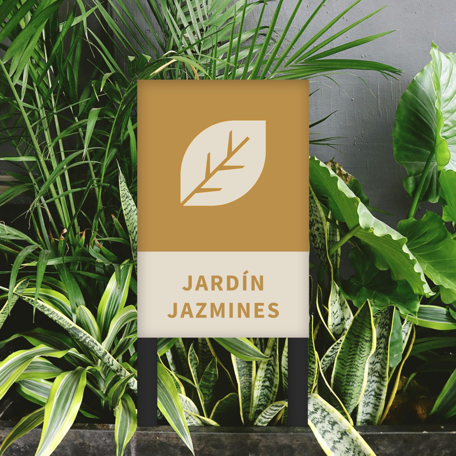
Mixed-use building in the heart of the San Diego neighborhood, the focus was on maintaining the client’s graphic identity, seeking to standardize visual resources, typography and iconography used in a previous project. The differentiation becomes evident when considering flows and navigation for two major users: mini storeage users and residents.
The building’s identity is constructed through elements, materials and graphics, guaranteeing a clean and contemporary aesthetic. The importance of providing macro-level information at each entrance of the building is emphasized, providing both vertical and horizontal orientation between the towers.
The color strategy is simplified by using 4 different colors for each of the 4 towers of the project, facilitating the navigation and orientation of the users. This comprehensive approach aims not only to meet functional needs, but also to create a coherent and distinctive visual experience for the diverse users of the building.
read more >


